Many thanks to Thomas Vander Wal for the many conversations that inspired this post.
The average life expectancy of a human being in the 21st century is
about 67 years. Do you know what the average life expectancy for a company is?
Surprisingly short, it turns out. In
a recent talk,
John Hagel pointed out that the average life expectancy of a company in the S&P 500 has dropped precipitously, from 75 years (in 1937) to 15 years in a more recent study. Why is the life expectancy of a company so low? And why is it dropping?
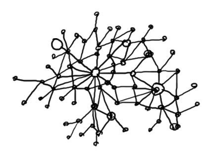
I believe that many of these companies are collapsing under their own weight. As companies grow they invariably increase in complexity, and as things get more complex they become more difficult to control.
The statistics back up this assumption. A
recent analysis in the CYBAEA Journal looked at profit-per-employee at 475 of the S&P 500, and the results were astounding: As you triple the number of employees, their productivity drops by half (
Chart here).
This “3/2 law” of employee productivity, along with the death rate for large companies, is pretty scary stuff. Surely we can do better?
I believe we can. The secret, I think, lies in understanding the nature of large, complex systems, and letting go of some of our traditional notions of how companies function.
THE COMPANY AS A MACHINE
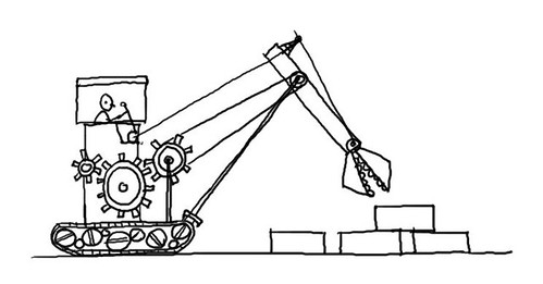
Historically, we have thought of companies as machines, and we have designed them like we design machines. A machine typically has the following characteristics:
1. It’s designed to be controlled by a driver or operator.
2. It needs to be maintained, and when it breaks down, you fix it.
3. A machine pretty much works in the same way for the life of the machine. Eventually, things change, or the machine wears out, and you need to build or buy a new machine.
A car is a perfect example of machine design. It’s controlled by a driver. Mechanics perform routine maintenance and fix it when it breaks down. Eventually the car wears out, or your needs change, so you sell the car and buy a new one.
And we tend to design companies the way we design machines: We need the company to perform a certain function, so we design and build it to perform that function. Over time, things change. The company grows beyond a certain point. New systems are needed. Customers want different products and services, so we need to redesign and rebuild the machine, or buy a new one, to serve the new functions.
This kind of rebuilding goes by many names, including re-organization, reengineering, right-sizing, flattening and so on. The problem with this kind of thinking is that the nature of a machine is to remain static, while the nature of a company is to grow. This conflict causes all kinds of problems because you have to redesign and rebuild the company while you also need to operate it – an idea dramatized in an EDS commercial from a few years ago:
Building an airplane in flight.
THE COMPANY AS AN ORGANISM
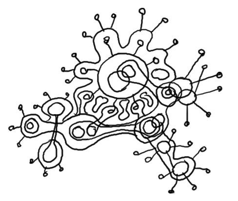
It’s time to think about what companies really are, and to design with that in mind. Companies are not so much machines as complex, dynamic, growing systems. As they get larger, acquiring smaller companies, entering into joint ventures and partnerships, and expanding overseas, they become “systems of systems” that rival nation-states in scale and reach.
So what happens if we rethink the modern company, if we stop thinking of it as a machine and start thinking of it as a complex, growing system? What happens if we think of it less like a machine and more like an organism? Or even better, what if we compared the company with other large, complex human systems, like, for example, the city?
Cities are large, complex, systems, but we don’t really try to control them. In
Stephen B. Johnson's book
Emergence: The Connected Lives of Ants, Brains, Cities, and Software
he quotes complexity pioneer
John Holland:
Cities have no central planning commissions that solve the problem of purchasing and distributing supplies… How do these cities avoid devastating swings between shortage and glut, year after year, decade after decade?
No, we don’t try to control cities, but we can manage them well. And if we start to look at companies as complex systems instead of machines, we can start to design and manage them for productivity instead of continuously hovering on the edge of collapse.
Cities aren't just complex and difficult to control. They are also more productive than their corporate counterparts. In fact, the rules governing city productivity stand in stark contrast to the ominous “3/2 rule” that applies to companies. As companies add people, productivity shrinks. But as cities add people, productivity actually grows.
A study by the Federal Reserve Bank of Philadelphia found that as the working population in a given area doubles, productivity (measured in this case by the rate of invention) goes up by 20%. This finding is borne out by study after study. If you’re interested in going deeper, take a look at this recent New York Times article:
A Physicist Solves the City.
Okay, you say, but cities are fundamentally different than companies. Just because this works for cities doesn’t mean that it will work for companies. Right?
THE LONG-LIVED COMPANY
Actually there’s some interesting data there too. Back in the early 1980’s, right after the revolution in Iran, Shell Oil was concerned about the future of the oil industry. What might Shell look like after oil, they wondered? So they commissioned a study with some very interesting parameters:
1. First, they looked only at large companies with relative dominance in their industries, companies similar to Shell in that regard.
2. Second, they looked only at companies with very long lifespans – 100 years or more.
3. Third, they looked at companies who had made a major shift from one industry or product category to another.
In other words, they looked at the immortals: the companies that didn't die.
The study was never published, but the findings were detailed in a book:
The Living Company
by Shell executive
Arie de Geus. Shell studied 40 large, long-lived companies, some of which were still surviving after 400+ years.
Interestingly, these companies had a lot in common with large cities:
Ecosystems: Long-lived companies were decentralized. They tolerated “eccentric activities at the margins.” They were very active in partnerships and joint ventures. The boundaries of the company were less clearly delineated, and local groups had more autonomy over their decisions, than you would expect in the typical global corporation.
Strong identity: Although the organization was loosely controlled, long-lived companies were connected by a strong, shared culture. Everyone in the company understood the company’s values. These companies tended to promote from within in order to keep that culture strong. Cities also share this common identity: think of the difference between a New Yorker and a Los Angelino, or a Parisian, for example. At
the Dachis Group we like to call this common culture
hivemind.
Active listening: Long-lived companies had their eyes and ears focused on the world around them and were constantly seeking opportunities. Because of their decentralized nature and strong shared culture, it was easier for them to spot opportunities in the changing world and act, proactively and decisively, to capitalize on them. At Dachis we sometimes call this dynamic signal (watching and listening) and metafilter (information leading to decisive action).
DESIGN BY DIVISION
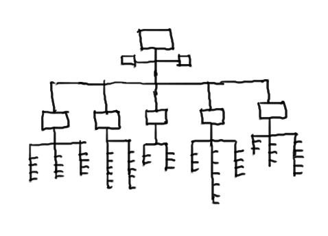
Historically we have designed companies like machines – by division. We construct the org chart to divide the big chunks of work and separate them from each other: Finance, Sales, Operations. We design the work flows that process inputs into outputs: raw materials into products, prospects into customers, complaints into resolutions.
As we design this kind of company – the divided company – we need to separate functions, which means people may not always have a sense of the larger thing they are working on. They get very good at one of the tasks, but lose touch with the larger picture. So we have to design rigid policies and procedures so people will function efficiently and so they won’t interfere with each others’ work.
The problem comes with scale. As the number of employees grows, the profit per employee shrinks. It’s a game of diminishing returns. Efficiencies of scale are balanced out by the burdens of bureaucracy. Divisions become silos, disconnected from each other. Overhead costs increase with size. The resulting need for control, and the inability to achieve it at a reasonable cost, is what eventually kills a business.
DESIGN BY CONNECTION
Although we tend to design companies like machines, we instinctively and intuitively understand that companies are not made of cogs, levers and gears. In the end, they are made out of people. For top management, it would be wonderful if we could put our business strategy into the machine, push a button and wait for the results. But it doesn’t work that way. You have to put your strategy into people if you want to get results.
And today, thanks to social technologies, we finally have the tools to manage companies like the complex organisms they are.
Social Business Design is design for companies that are made out of people. It’s design for complexity, for productivity, and for longevity. It’s not design by division but design by connection.
To design the connected company we must focus on the company as a complex ecosystem, a set of connections and potential connections, a decentralized organism that has eyes and ears everywhere that people touch the company, whether they are employees, partners, customers or suppliers.
Social Business Design is a new discipline, but some basic rules are already emerging. These emerging rules have less in common with traditional business design, and more in common with urban design and city planning. It’s not about design for control so much as design for emergence. You can’t control a complex system, but you can manage its growth, and there are a lot of things you can do that will position it for success. Here are a few of those emerging practices that signal excellence in design by connection:
Understand the culture: A company is like a city in many ways. First and foremost, a city is about the people who live and work there; it’s an expression of their collective culture. Before you can start your path to the connected company, you need to understand the culture (or cultures) that are already there, so you can look for ways to enhance and strengthen that shared identity.
Start small. Urban designers might look at maps or aerial views as they make their plans, but the life of a city happens at street level. As you initiate social programs, think of them as if you are designing a city street. A successful street is filled with people. The last thing you want is a whole bunch of large, urban areas with no people in them. In a city, big, open, empty spaces feel unsafe and unloved. So start small. The smaller the space is initially, the faster it will fill up with people. A good way to start is with an organization-wide project or initiative that requires participation from a number of people across the company. This gives you a cross-section of ideas and perspectives to look at as you plan the next stage.
Spaces need owners. Again, think of the city street: every business or building has an owner. The sidewalks have owners – typically every business at street level “polices” their stretch of sidewalk. And even the street has owners – the street sweeper, the cop on the beat. In the same way, make sure that every online space you create has someone positioned to take care of it, to keep it safe and clean.
Every person needs a place. In the same way that public spaces need caretakers, every person needs a place to live; somewhere they can put their stuff. As you build your social business, make sure that every single person has a place where they can put, and see, their stuff: their projects, the links they want to get back to, the documents they have created, their role, qualifications, expertise and so on.
Jumping-off points. A good city street offers opportunities that are unanticipated but serendipitous. The promising side-street. The sound of music coming through an open door. As you design for connection, think about how you might create those unexpected, but delightful, surprises. Every time someone visits an online space, there’s a chance to offer them something new.
Watch, listen, adjust and adapt. Design by connection is not a top-down activity so much as bottom-up. Complex systems just don’t work that way. In a complex system, you need to pay attention to small things and make little adjustments along the way. Think about how city streets evolve: one small step at a time. One retailer moves to a larger space; another goes out of business. One old building is torn down and replaced; another is rehabbed and turned into lofts. Pay attention to the culture, and watch how people react to the tools you provide. Are they using something in a different way than you expected? Find out why and see if you can enhance that. And what are they ignoring? If they’re not using something you expected them to use, go talk to them and see if you can figure out the reason.
The typical company has a very short life, from 15 to 50 years. But cities – and some companies – live much longer lifespans: from hundreds to thousands of years. Wouldn’t you like that for your company? I know I would.
If you have thoughts I would love to hear them. Please take a moment and leave a comment.
UPDATE: The book "The Connected Company" is now available on Amazon!
UPDATE: Based on the extreme volume of response to this post I have set up an email discussion group for those who want to continue the conversation. Please join us
here.
Keep in touch! Sign up to get updates and occasional emails from me.


"[Ubicomp is] the idea of integrating computers seamlessly into the world at large ... not simulating the world so much as enhancing the one that already exists ... [most of them] will be invisible in fact as well as in metaphor ... These machines and more will be connected in a ubiquitous network.
Today's design challenge, says Kuniavsky, is to create a practice of ubiquitous computing user experience design. Such a practice is by necessity cross-disciplinary, involving identity design (what makes the product or service memorable and unique), interface design (modes of functionality), industrial design (physicality), interaction design (how you can interact with it), information design (how it displays information), service design (how the service maintains consistency across many objects devices and experiences), and information architecture (organizing principles for the information).
That's a lot of D words! In other words it takes a team, and this will only increasingly be the case. The practice is changing quickly, and with the power to transform society comes great responsibility.
Check out the whole set on Flickr, and please share your thoughts in the comments section!